Visualizing Data
This English proverb is particularly relevant in the context of Data Science and Modeling. While summary statistics are a good starting point, they don't give you the full picture and in many cases patterns would be hiding inside the point estimates from your summary statistics. That is why Data Visualization & Exploratory Analysis is an important step in the Machine Learning/Modeling pipeline. An hour spent in exploratory analysis could save you weeks in modeling and hundreds of dollars in compute time. In this module, we will use the Iris dataset and the StatsPlots Julia package to teach you how to do quick data visualization and look for patterns.
using Plots
using StatsPlots
using RDatasets
using DataFrames
data = dataset("datasets", "iris")
To plot a specific column in your dataset, you need to know the column names of your data.
names(data)5-element Array{String,1}:
"SepalLength"
"SepalWidth"
"PetalLength"
"PetalWidth"
"Species"Now we will take a look at SepalLength
histogram(data.SepalLength,
    xlabel="SepalLength", ylabel="Frequency",
    linewidth=0.2, palette= :seaborn_deep,
    grid=false,label="")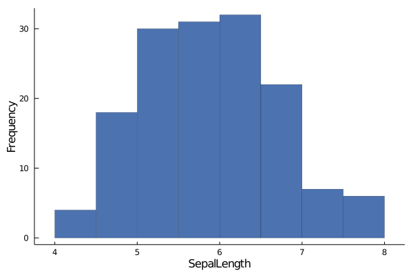
histogram()is a function from Julia'sPlotpackage that takes a 1D array and displays how the data is distributed within that array.The above plot tells us that majority of the values in
SepalLengthlies between the values of 5 &7.The Y-axis tells you how many elements are there in a particular range. The above plot tells us that there are close to 30 elements in
SepalLengthwhose values lie between 5 & 5.5.
Similarly, we can take a look at SepalWidth
histogram(data.SepalWidth,
    xlabel="SepalWidth", ylabel="Frequency",
    linewidth=0.2, palette= :seaborn_deep,
    grid=false,label="")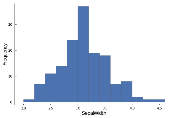
How about PetalLenght now?
histogram(data.PetalLength,
    xlabel="PetalLength", ylabel="Frequency",
    linewidth=0.2, palette= :seaborn_deep,
    grid=false,label="")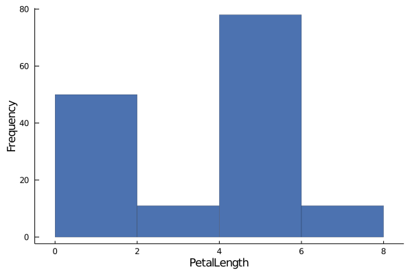
Ok, this histogram looks off. In the last two histograms, you could see a pattern in the distribution of the data, whereas in this histogram, it is hard to tell if there is any pattern.
One fact we know about the Iris dataset is that, it contains data about different species of the iris flower.
What if, we group the PetalLength by their species and then try to interpret the histogram?
groupedhist(data.PetalLength,
    group = data.Species,
    xlabel = "PetalLength", ylabel ="Frequency",
     bar_position = :stack, palette= :seaborn_deep, linewidth=0.2)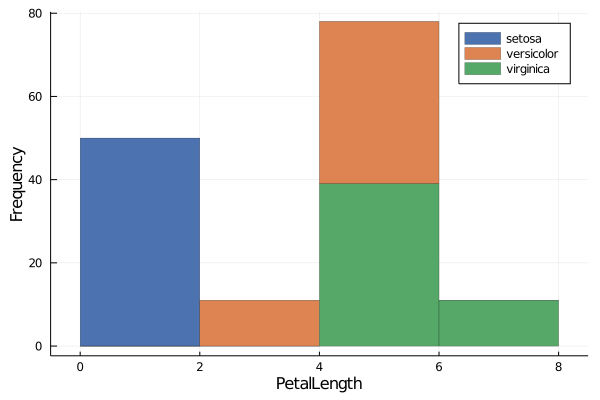
groupedhist()is a function that comes with theStatsPlots.groupedhist()helps us to visualize histogram of a column, when we want to group the values within the data by some categorical variable.groupedhist()takes in the 1D array as in thehistogram()function. But in addition to that,groupedhist()also takes in an argument calledgroup. Here you mention the column by which you would like to group the array you initially passed.Now the previous histogram makes sense. The histogram in the last plot was not actually a single distribution, but 3 different distributions hiding under one!
Now let's move on to PetalWidth.
histogram(data.PetalWidth,
    xlabel="PetallWidth", ylabel="Frequency",
    linewidth=0.2, palette= :seaborn_deep,
    grid=false,label="")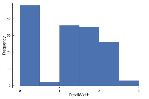
Having seen what happened with
PetalLength, it is not hard to guess what's going on here and you know exactly what to do!
groupedhist(data.PetalLength,
    group = data.Species,
    xlabel = "PetalLength", ylabel ="Frequency",
     bar_position = :stack, palette= :seaborn_deep, linewidth=0.2)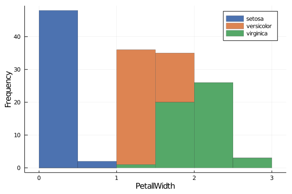
While a histogram gives you idea about a single column, a scatterplot tell you visually how a pair of column are is correlated.
Let's see if there is any relationship between SepalLenght and SepalWidth
scatter(data.SepalLength, data.SepalWidth,
    xlabel="SepalLength", ylabel="SepalWidth", grid=false, label="",
    palette= :seaborn_deep)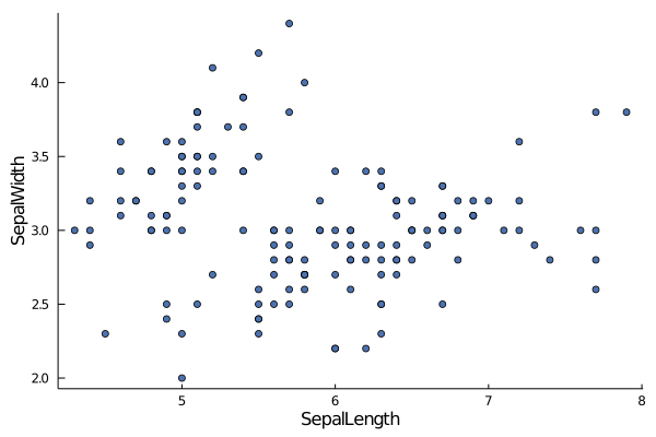
Like in the case of histogram, we can group data points by categorial variable to see if there are any underlying pattern.
scatter(data.SepalLength, data.SepalWidth,
    group=data.Species,
    xlabel="SepalLength", ylabel="SepalWidth", grid=false,
    palette= :seaborn_deep)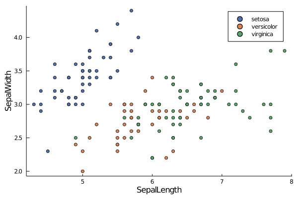
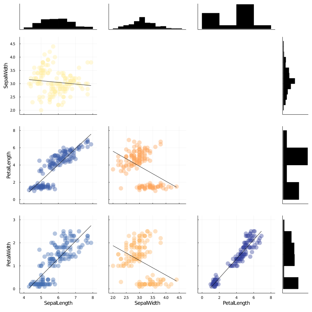
Since creating plots for every column and every column pairs is a time consuming task, StatsPlots has put together a single function to generate all these plots at once.
cornerplot(Array(data[!,1:4]), label=names(data[!,1:4]),
                size=(1000,1000), compact=true)